The Trevor Project
Rebrand & Website Redesign
As the Trevor Project's first in-house Creative Director, I led a full-scale rebrand and website relaunch, responsive to over a decade of brand and product evolution, designed to serve multiple audiences and campaigns.
My Role: Creative Director
Challenge
Since the early 90s, The Trevor Project has been one of the most respected non-profit services, thanks to its lifesaving work in suicide prevention and crisis services for LGBTQ+ young people. But by 2019, Trevor had expanded far beyond its original Trevor Lifeline (phone crisis service) to include chat and text-based crisis services, as well as Trevor Space, a global peer-support community for LGBTQ+ youth, and many initiatives in the advocacy and education spaces. However, as these services evolved, the website and brand had not kept pace, resulting in a fragmented, outdated, and difficult-to-navigate digital experience.
LGBTQ+ young people seeking support needed a clearer, more intuitive pathway to access crisis services quickly, whether through phone, chat, or text. At the same time, the organization’s broader audiences—donors, advocates, and corporate partners—also needed better navigation and messaging alignment to fully engage with Trevor’s work.
Beyond usability, the brand itself needed to better reflect the expanded diversity of the LGBTQ+ youth it served. Language, identity, and self-expression had evolved significantly since Trevor’s last major brand refresh, and the existing website lacked the inclusive language, educational resources, and representation necessary to truly serve its community.
Ultimately, the Trevor Project needed a comprehensive digital and brand transformation—one that would bring clarity, cohesion, and inclusivity to its services while ensuring that every young person could easily and confidently access the support they needed.
Strategy & Execution
As Creative Director, I partnered with award-winning branding agency Kettle and led every step of this transformation—from defining the strategic foundation to overseeing the visual identity, brand voice, and website overhaul—ensuring the new brand would be as bold, inclusive, and dynamic as the community it serves.
Establishing the Brand Foundation
We started by going deep into The Trevor Project’s history, mission, and evolution, conducting months of focus groups, stakeholder interviews, and audience surveys to understand the real needs of LGBTQ+ youth. This research shaped a new strategic brand DNA—core pillars that would guide every creative decision moving forward.
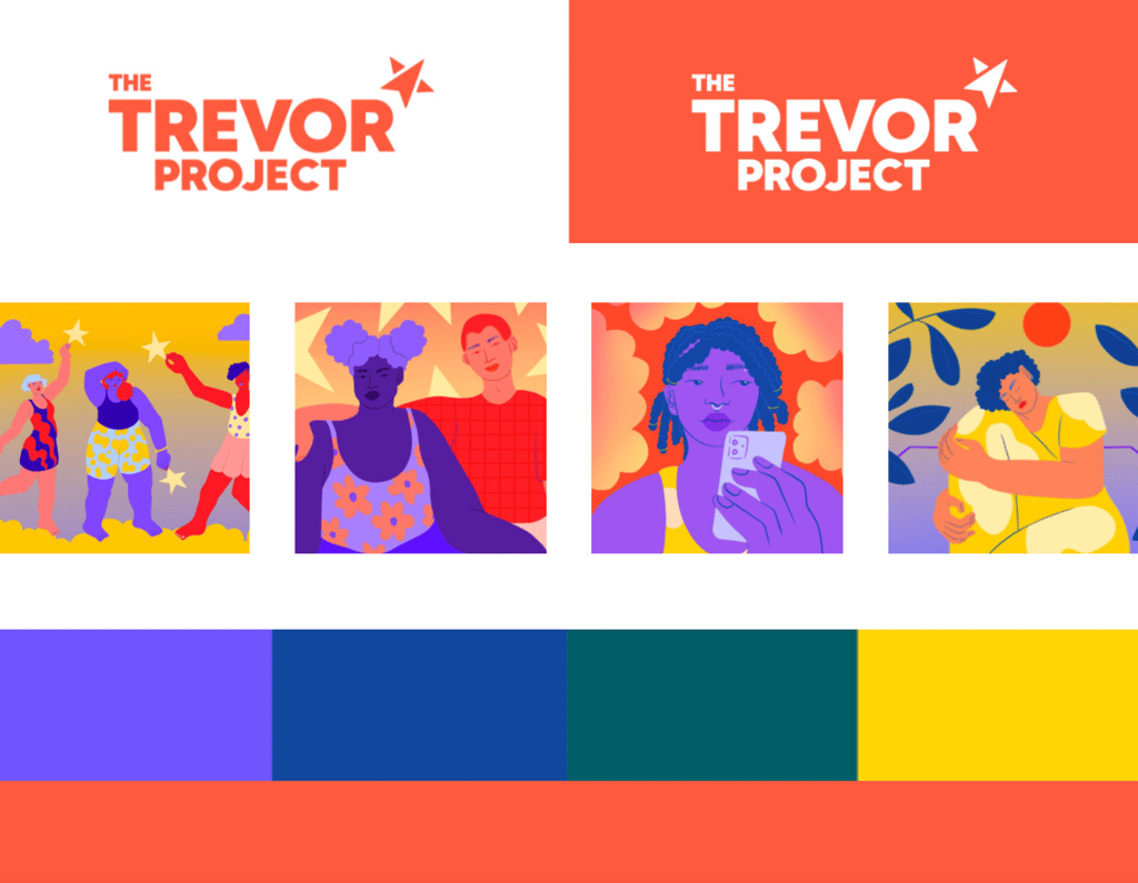
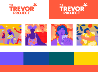
A New Visual Identity
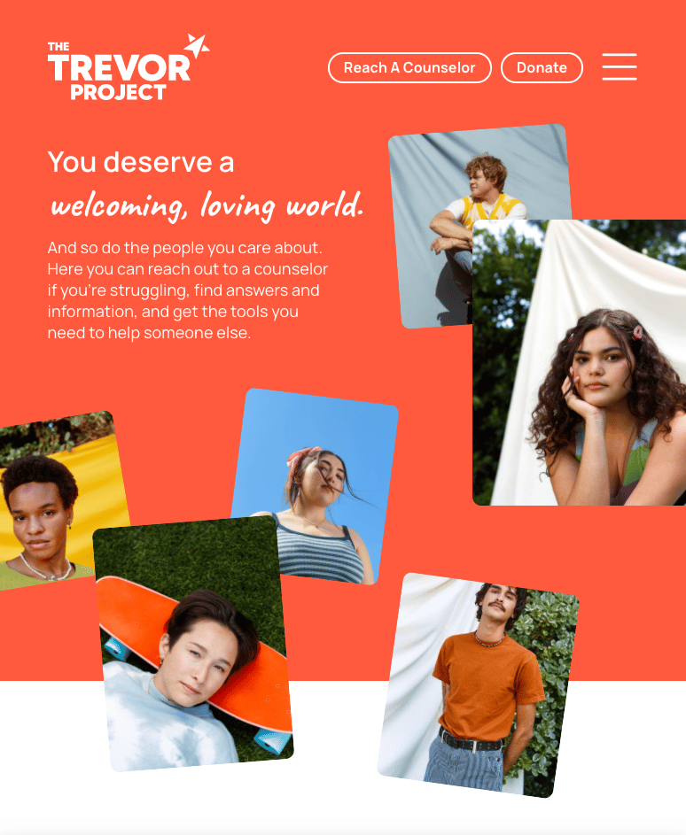
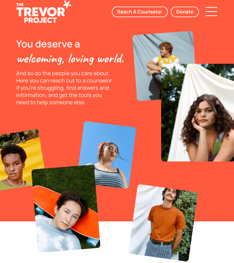
The brand refresh needed to honor Trevor’s legacy while making it feel modern, accessible, and uplifting. Working closely with my internal team and our agency partner, we designed a new look and feel that was:
Calming & Inclusive: Textures, typography, and gradients were tested with young LGBTQ+ audiences to ensure the experience felt safe, welcoming, and non-intimidating.
Optimistic & Forward-Thinking: We refreshed Trevor’s signature orange, modernizing it for digital use and expanding the palette with soothing gradients that created a sense of warmth and hope.
A True Reflection of LGBTQ+ Youth: Every design choice, from fonts to color accessibility, was validated through community feedback and user testing, ensuring it resonated with the full spectrum of young people Trevor serves.
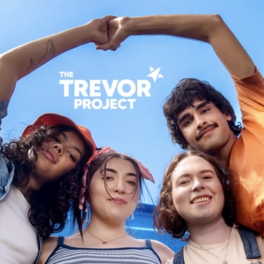
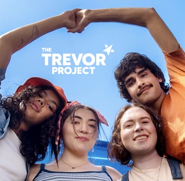
The logo evolution focused on making The Trevor Project feel both powerful and approachable. We chose a striking sans-serif typeface to enhance strength and clarity while evolving Trevor’s iconic star into a forward-pointing symbol, representing hope, resilience, and progress—a visual compass for young people navigating difficult emotions and circumstances.
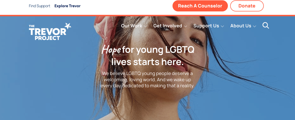
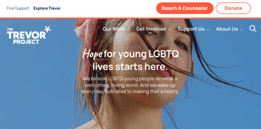
The Website Overhaul
The Trevor Project’s new website needed to be mobile-first, deeply intuitive, and built with safety and accessibility at its core. I led the UX and information architecture strategy, ensuring that every user—whether an LGBTQ+ young person, a parent, a donor, or an ally—could quickly and easily find the support they needed.
Results
Key improvements included:
Two Clear User Pathways: One for LGBTQ+ youth needing crisis services, and another for parents, volunteers, and professionals looking to support them.
"Reach a Counselor": One of my clear mandates was that no matter where on the site you were, “Reach a Counselor” was a persistent anchor element at the top nav bar, ensuring the needs of our primary user were never out of focus
A Streamlined, Accessible Experience: Research-driven updates ensured quicker access to life-saving support, with a fully redesigned TrevorLifeline, Chat, and Text integration.
Critical Safety Enhancements: We refined and tested tools like the Quick Exit feature, which allows users to instantly leave the site and erase their browser history—a crucial addition for young people in unaccepting households.
As a result of our work, The Trevor Project was honored as AdWeek's Brand Save Award (2021).
Every design and content decision was validated through extensive user testing, ensuring that the final experience wasn’t just beautiful—it was functional, safe, and truly representative of the young people Trevor serves.